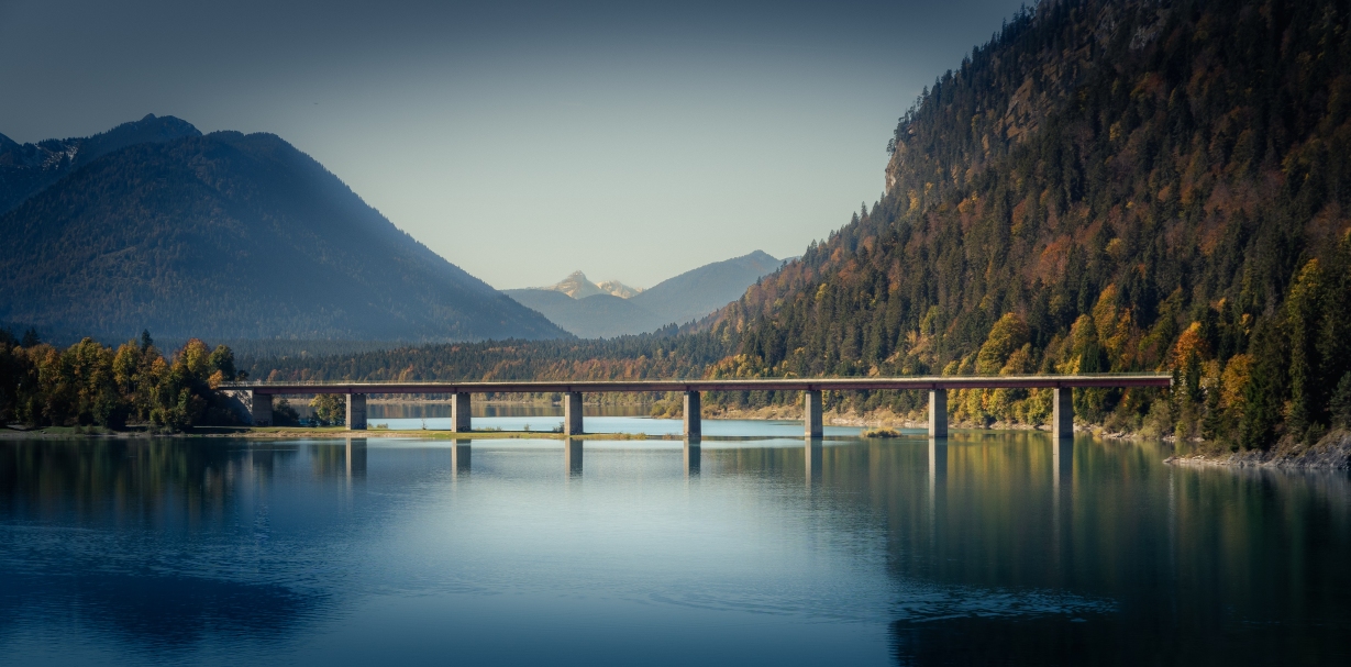
This post is a consecutive of previous The Bridge-post. As a brief wrap up: This day was one of the rare days where I went out explicitly to explore some photo locations that I searched before on a couple of maps. Actually, I didn’t even expect to be able to do some nice shots as it was during the mid of the day. Not the perfect light for epic photos. Nevertheless, while I went away from the previous spot, I caught a glimpse through some branches. “This could make up a great framing for this motive” I thought and so I quickly pulled out the camera again and just tried.

Even though the motive is quite the same as the one in The Bridge, I didn’t do as much postprocessing as in the other shot. Maybe because it was already tired from the other edit – maybe also because the framing just made it so different that the photo doesn’t live so much from the layered composition. But man was I happy to see that the framing could work as desired!

I used a couple of global adjustments like reducing the exposure, lowering the highlights, increasing the shadows and raising the dynamics a bit. Some tweaking in color grading gave it a unique style by pushing the midtones and highlights a little to the yellow and the shadows a bit into the blue.
Ways more was then done in the local adjustments:
- Crop! the right and bottom part were too heavy and made the overall composition a bit too imbalanced. So I first cropped a bit off both sides.
- The construction parts on the bridge were a visual pain! Especially the white ones in the middle of the bridge – so again: stamping, stamping, stamping. Sidenote: do NOT stamp when zoomed in very far! You might start stamping every flower and get lost in the details. Zoom in and out (z-Key in Lightroom) to stay focused on the real disturbances!
- A radial gradient filter in the middle (negative vignette) to increase the color temperature and give the whole scene a warmer touch.
- A large and soft vignette to draw the focus to the center. Besides the usual darkening, I also reduced the clarity quite a bit. I also reduced the color temperature a little
- The mountain on the left received two edits:
- ob the left (sunny) side I just increased the clarity
- on the shady side I just emphasized the shadows and reduces the brightness
- Finishing off with the sky: I (again) reduced the color temperature and exposure. A polarizer might have done a good job as the sun was coming nicely from the side. I even had it with me. Yet I’m not sure about the reflection in the lake – I should simply have tried it with and without polarizer – a lesson that I learned more than once on this trip.
After all, I really love the edit and the framing. Compared to the original post – I really cannot tell which one I like better – they are just rather different.